Learning Different
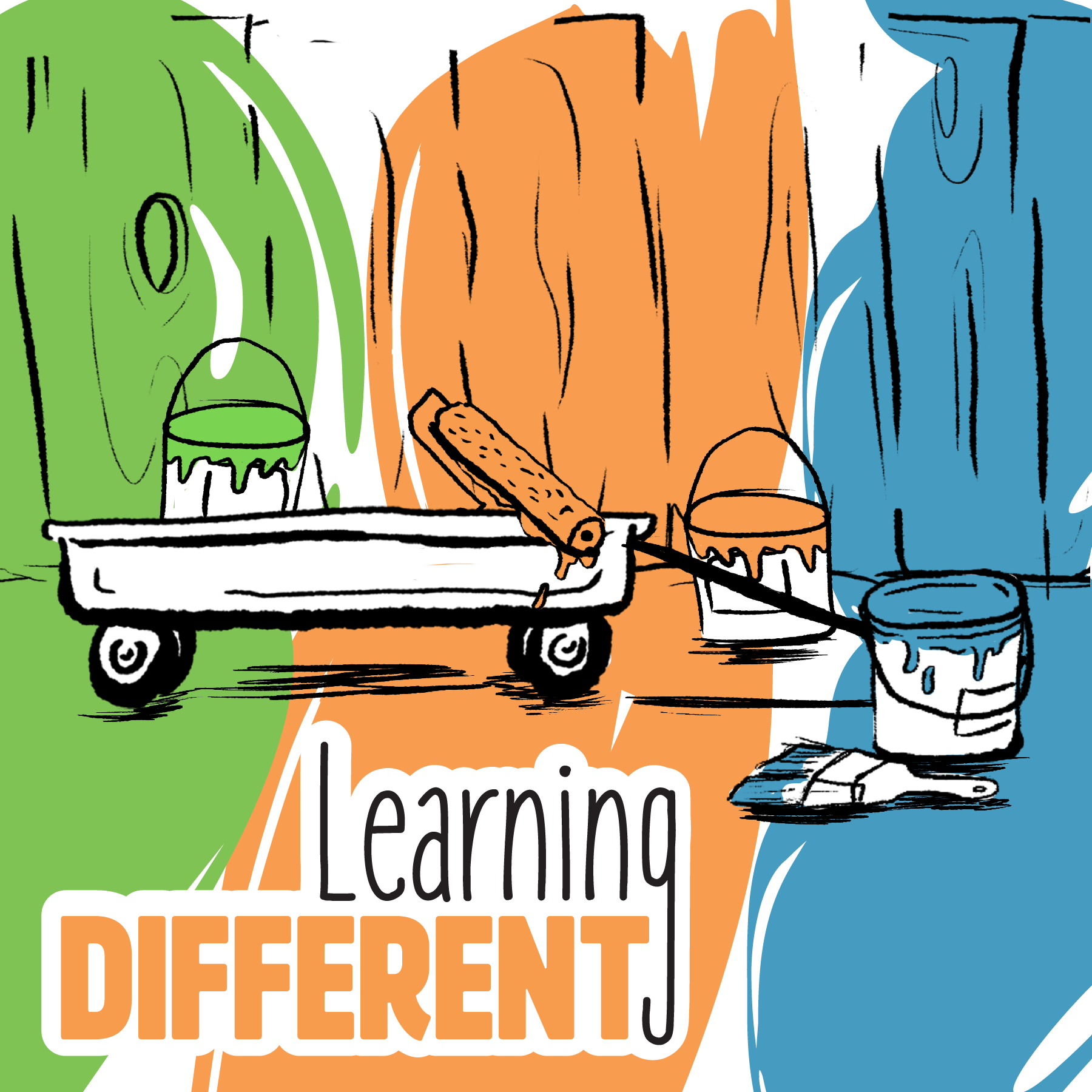
Learning Different was created for my senior BFA exhibition during my final year at Murray State University. It is a variety of branding and product design projects for at-home learning aids that explore the concepts of inclusive design principles and raising awareness of consistent education opportunities for children part of the neurodivergent community. These concepts are explored in multiple mediums I have found myself drawn to including graphic design, screenprinting, bookbinding, and more.
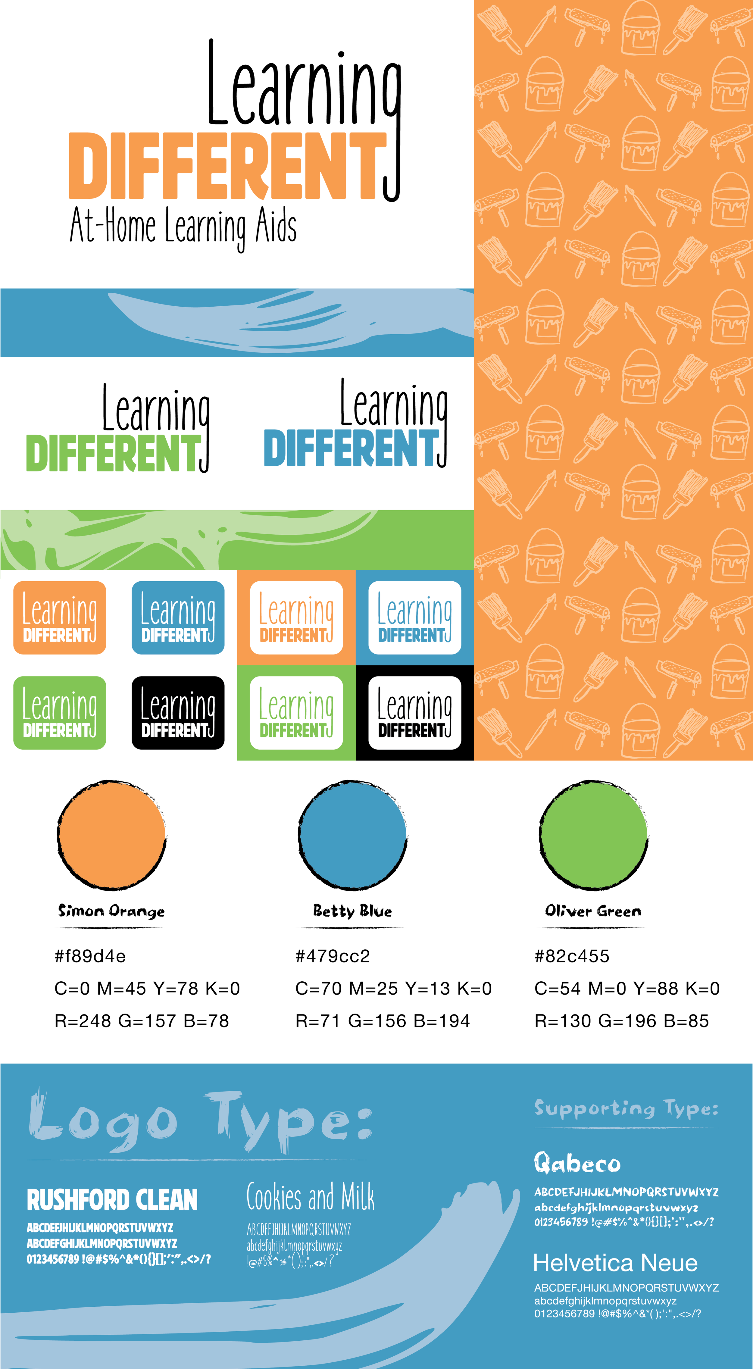
Logo, Color, & Type
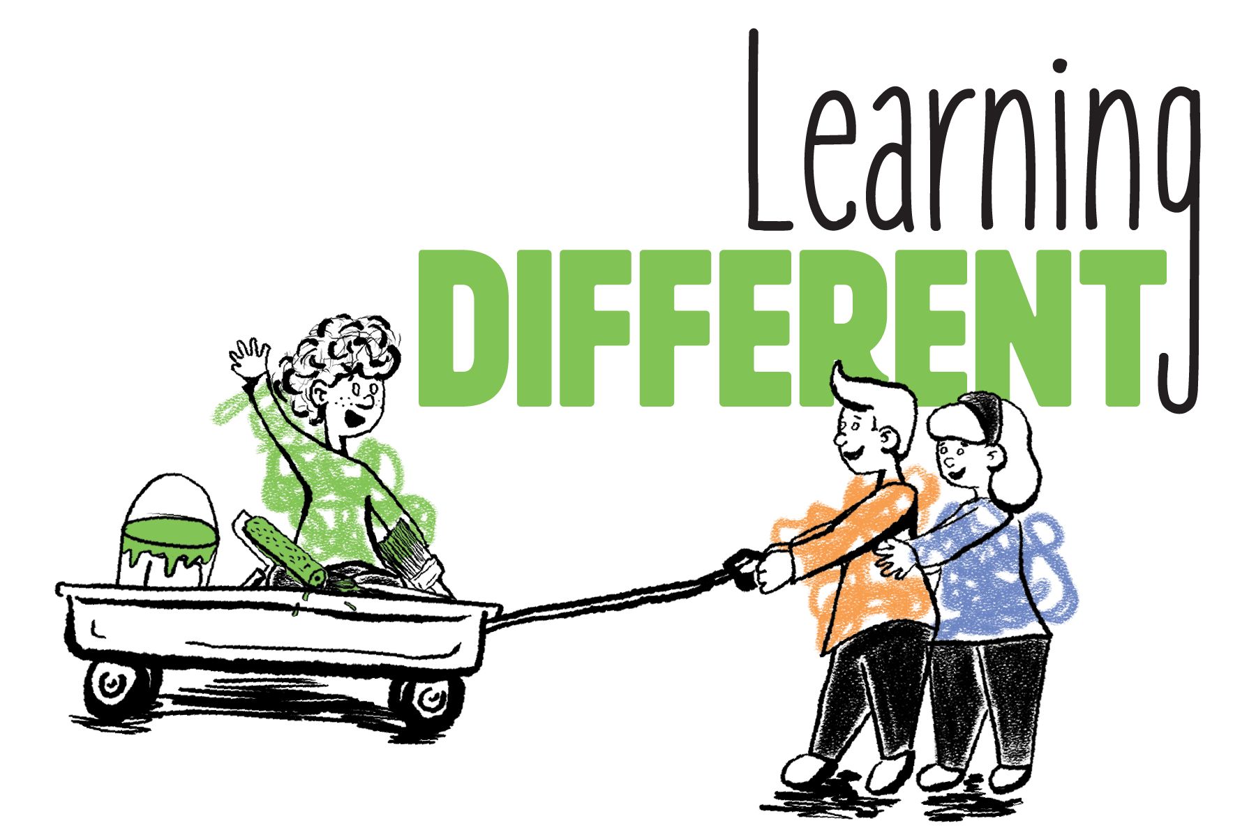
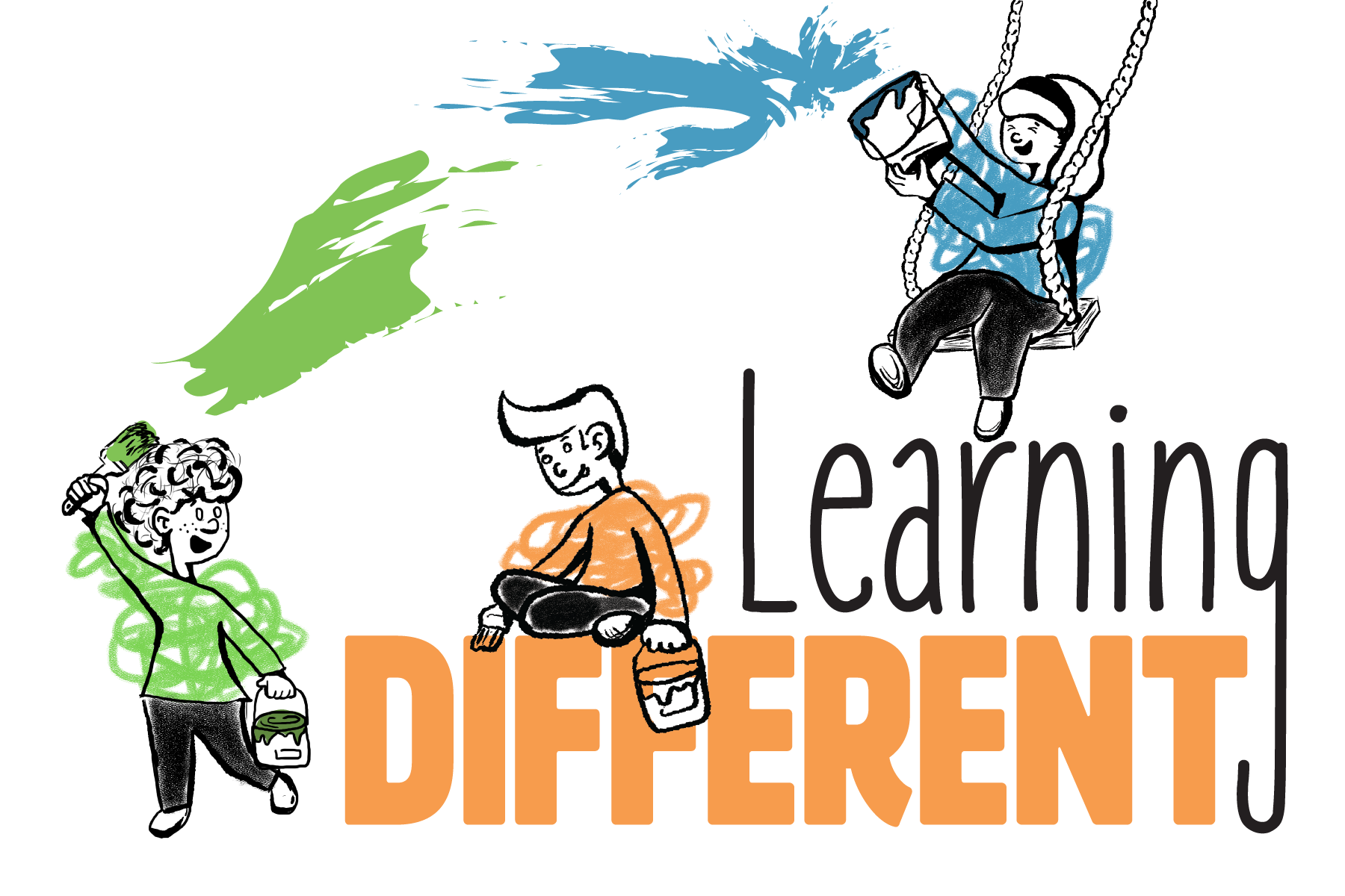
The overall goals and values of Learning Different were to create a brand and products that were approachable, multi-functional, and inclusive. The brand’s logo and mascots were designed to represent the brands approachability and functionality. Body typography that was used throughout the products themselves was also used with the idea of inclusivity and functionality behind it by including the use of dyslexic friendly typefaces like helvetica. The brand colors also played into reinforcing these goals by using bright, high-contrast captivating colors. These include a warm orange, lively green, and a welcoming teal blue. This wide range of colors is also a nod to the wide spectrum of colors used to represent neurodivergence awareness.
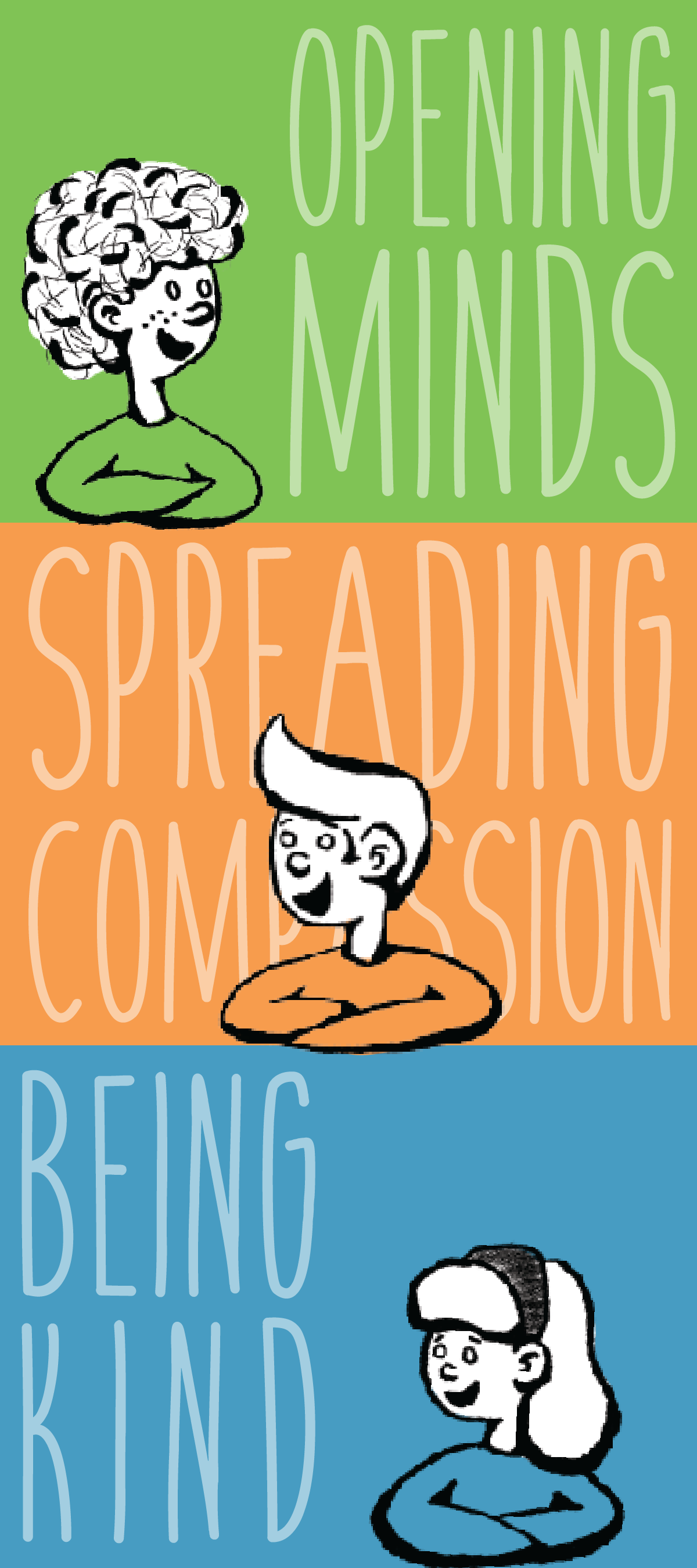
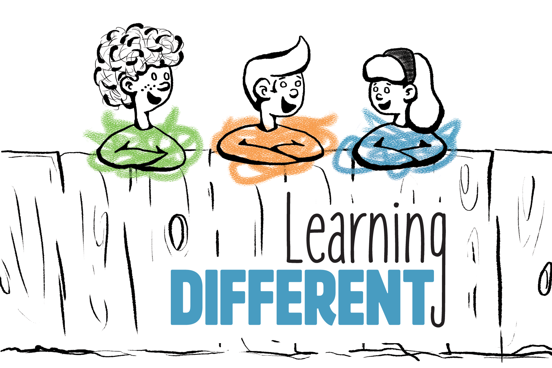
Meet Learning Different’s Mascots
The main purpose of the 3 illustrated characters was to assist in branding organization and recognizability across the multiple products and supporting collateral. There are 3 Learning Different mascots: Oliver, Simon, and Betty. Each character’s name corresponds with one of the brands core values: “opening minds to learn new thing,” “spreading compassion to ourselves and others,” & “being kind to minds of all kinds.” Each character is was also designed in a heavily stylized and clean yet childlike illustration style in order to better appeal to a specific targeted demographic. The development process and final design of these mascots also helped solidify the overall illustration style across the entire Learning Different brand. These methods allowed me to establish a more solid link between the characters used in products and the brand identity itself.


At-Home Learning Aids & Collateral
A variety of of products were explored, designed and created for this project in order to equally address both the many different common concerns that would be considered in the education of neurodivergent children and the various platforms the brand would be interacted through. The wide range of collateral created includes various scales of packaging, multiple types of learning aids and how said aids are interacted with, promotional material, and even how this body of work would be presented in an expo setting.
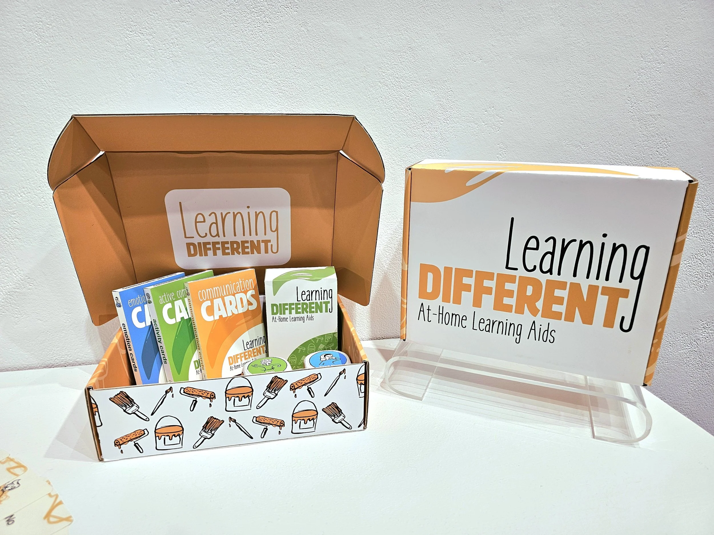
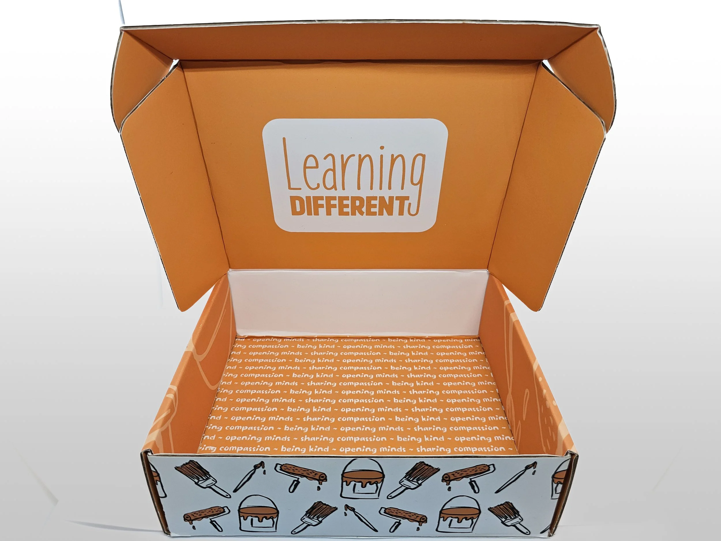
Learning Different Subscription Box
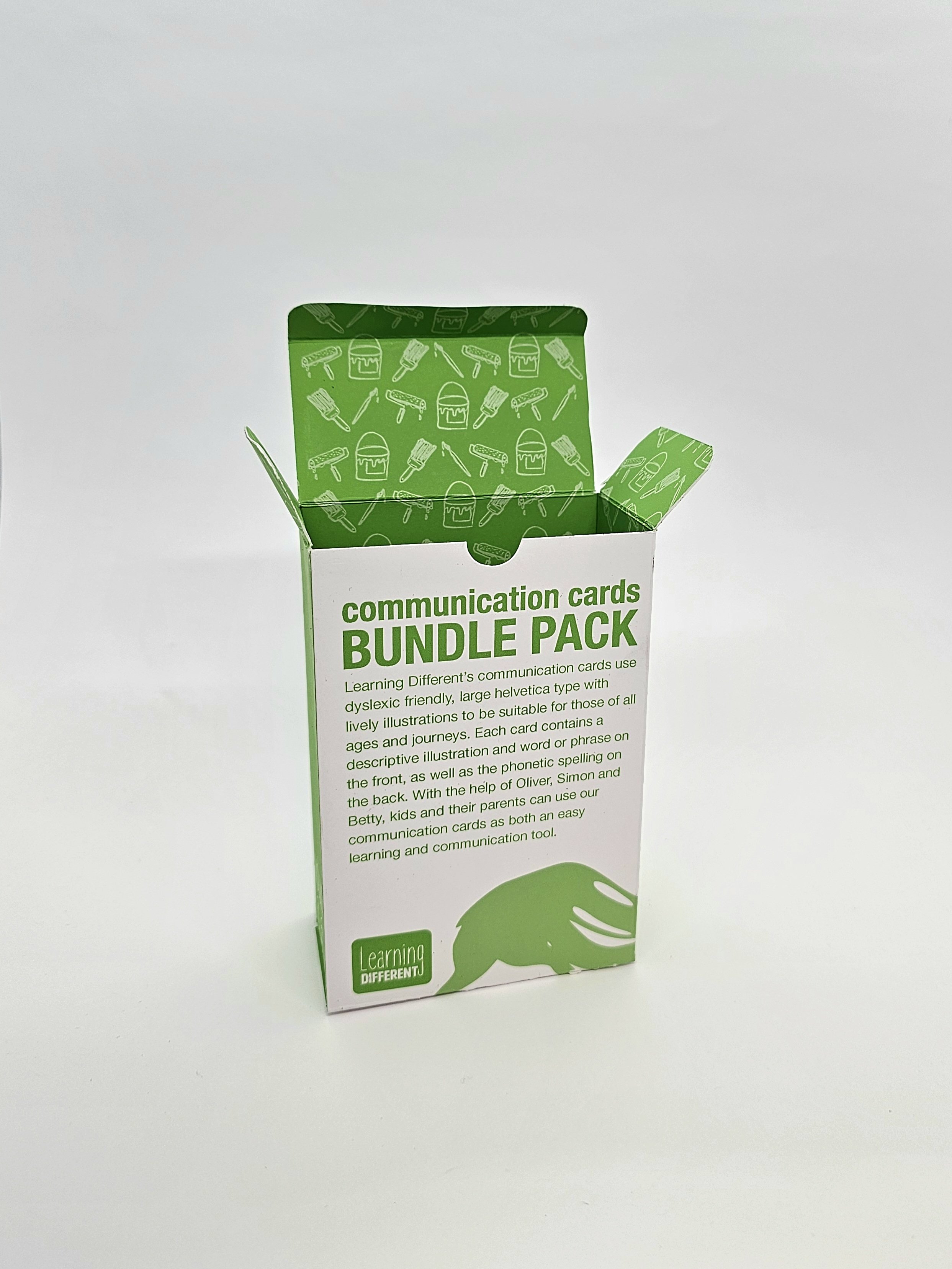
Communication Cards Bundle Box
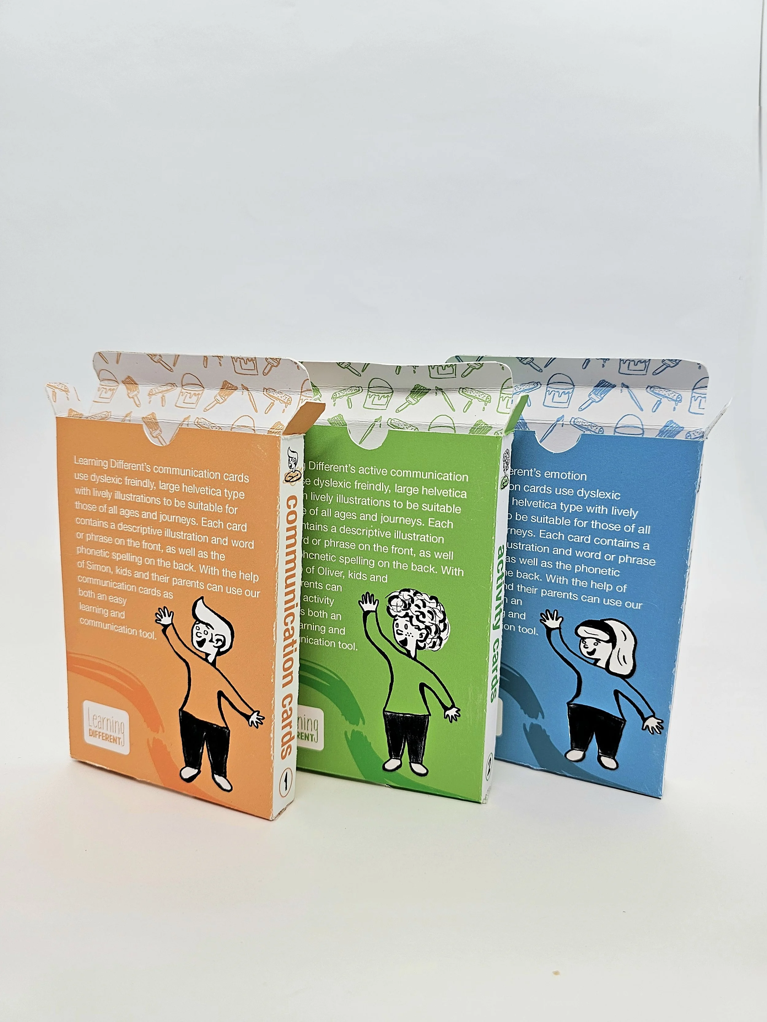
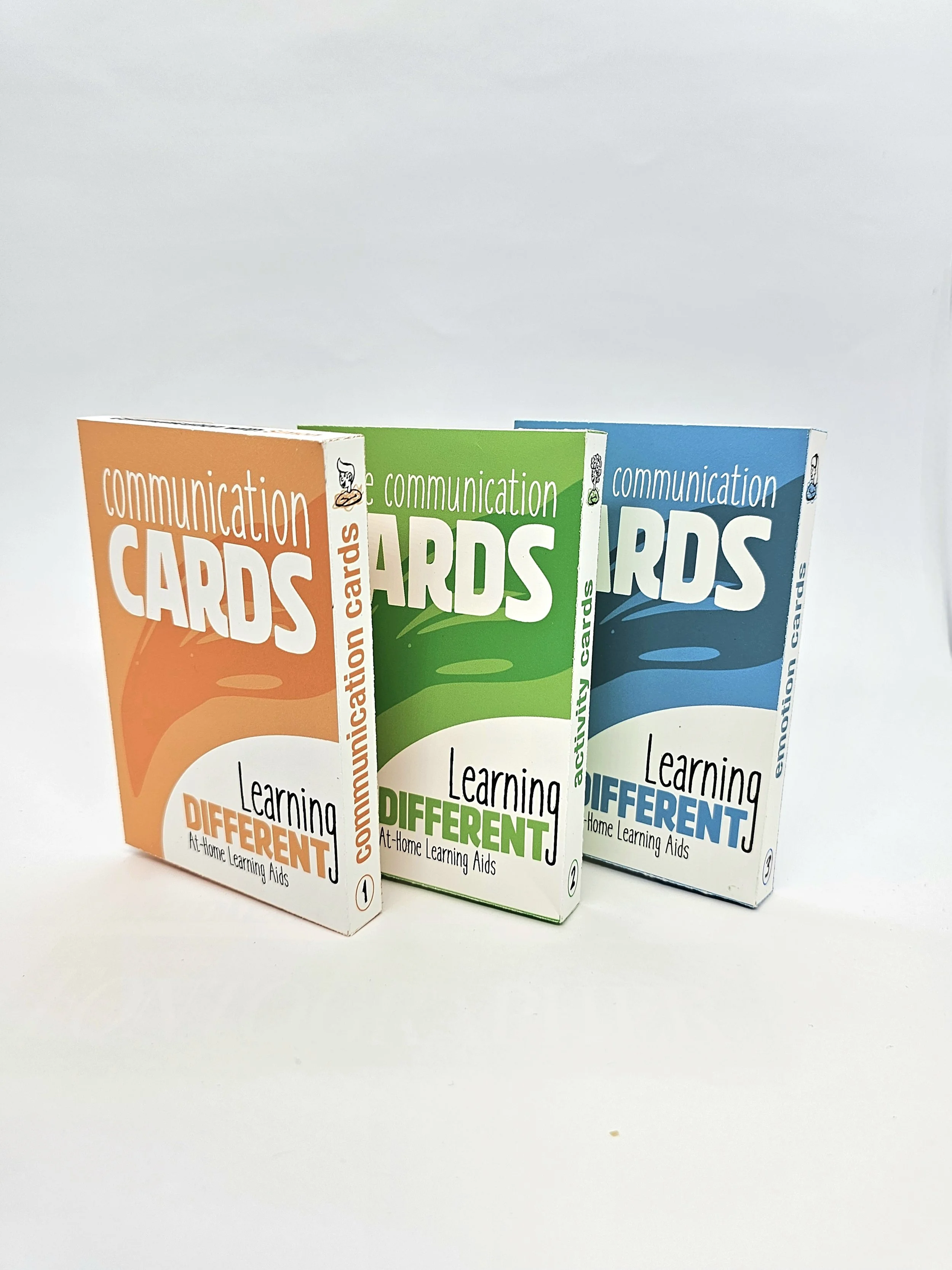
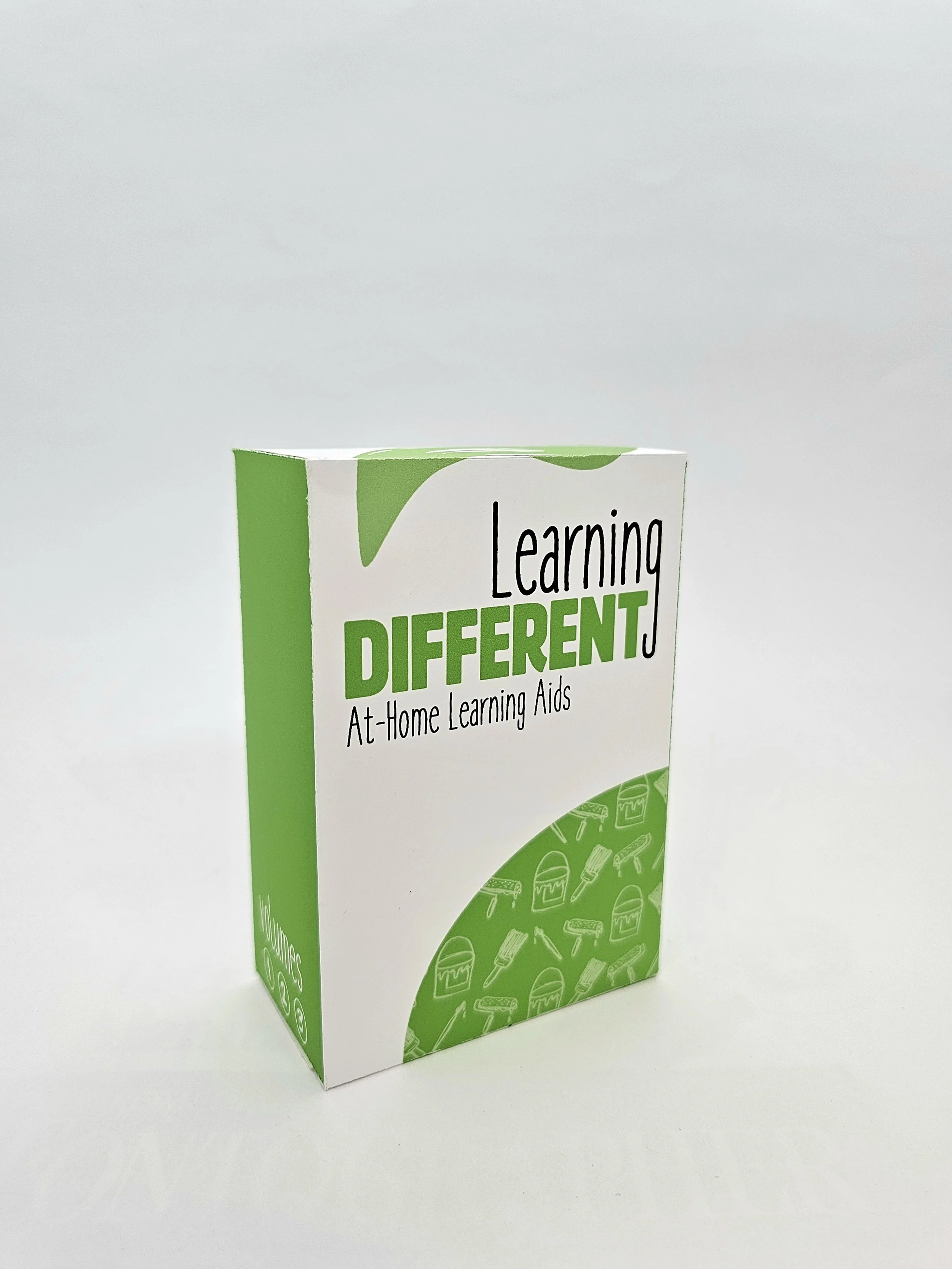
Communication Cards Volumes 1-3 Boxes
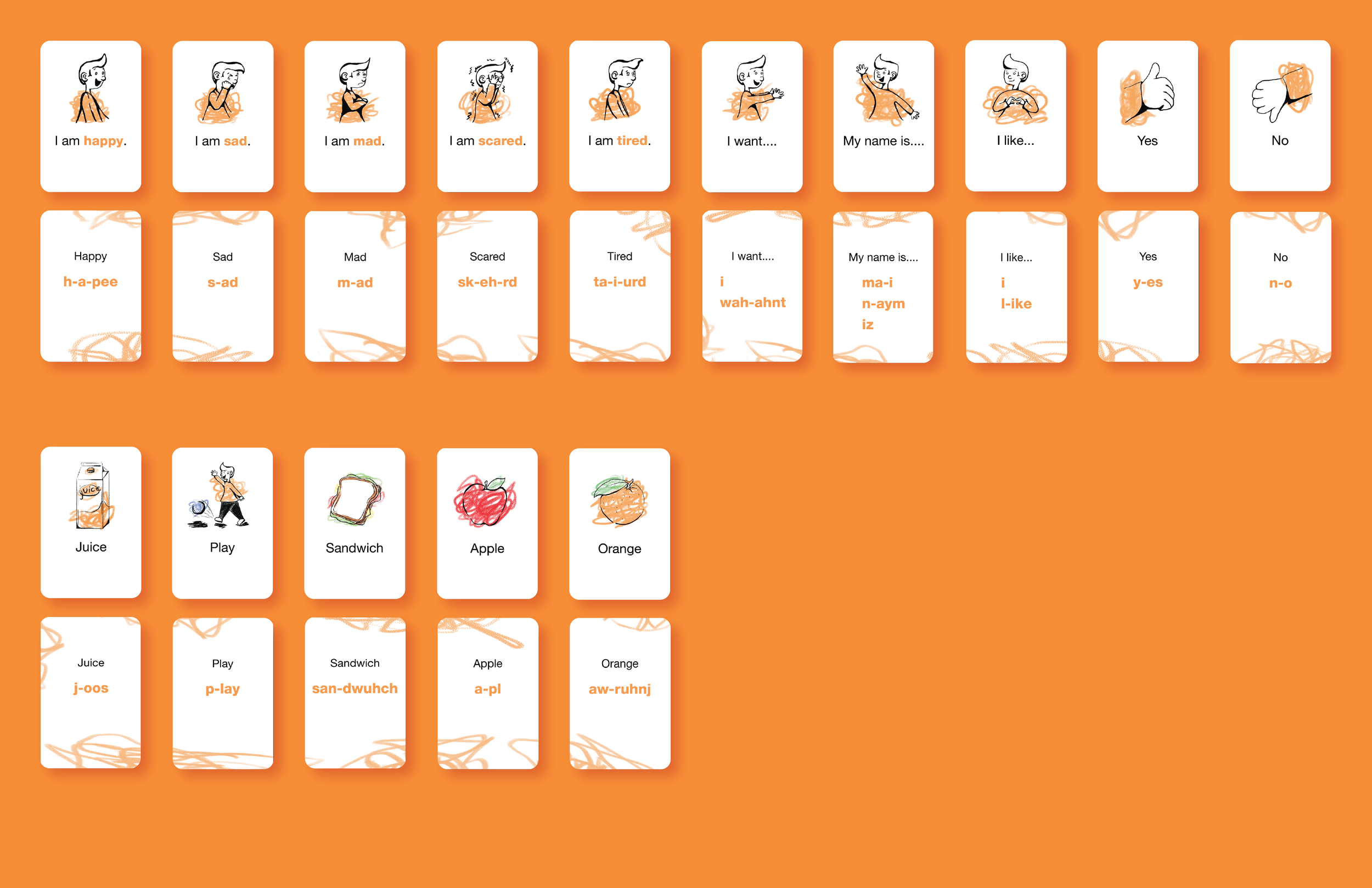
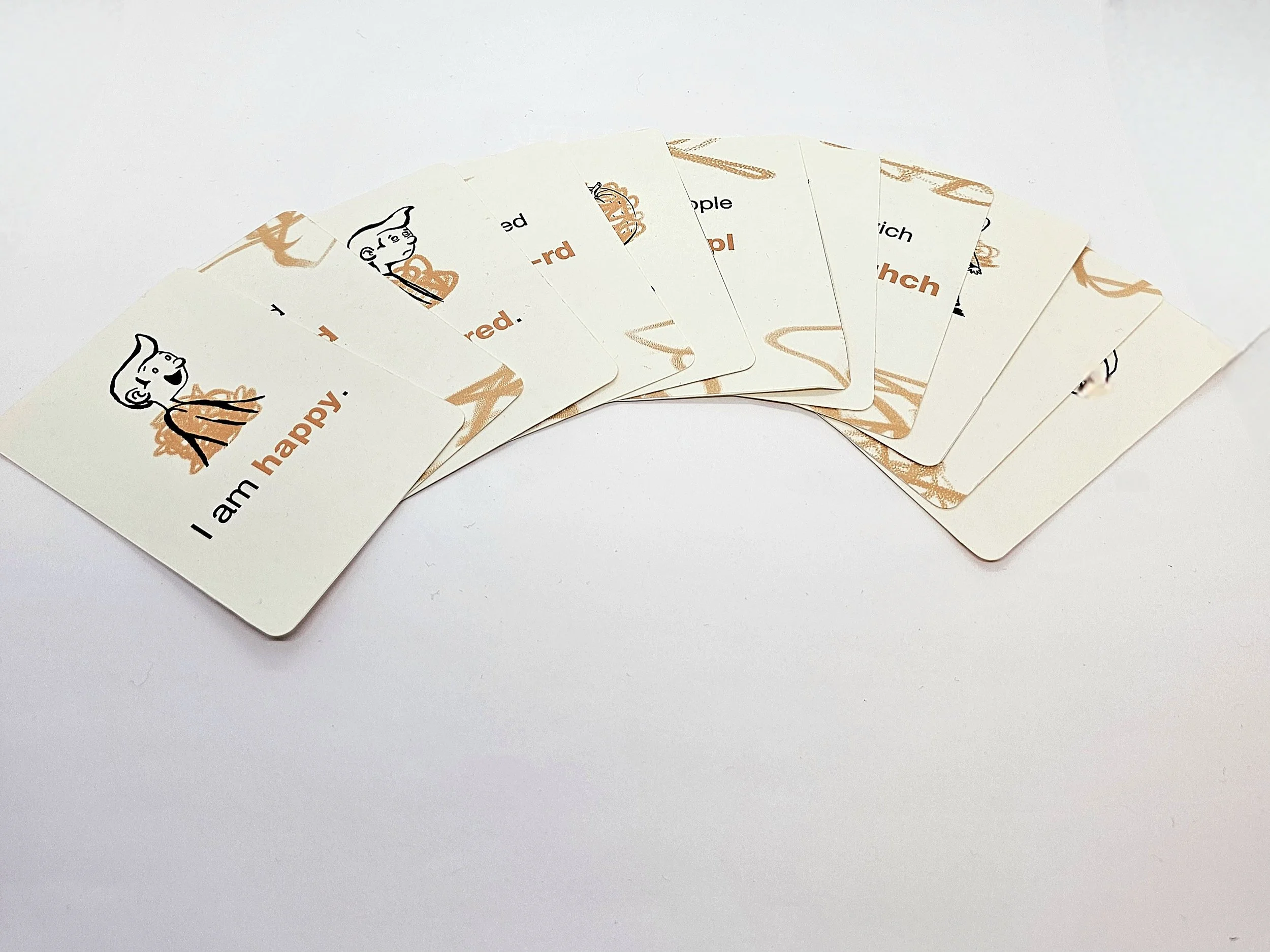
Volume 1 Communication Cards Sample
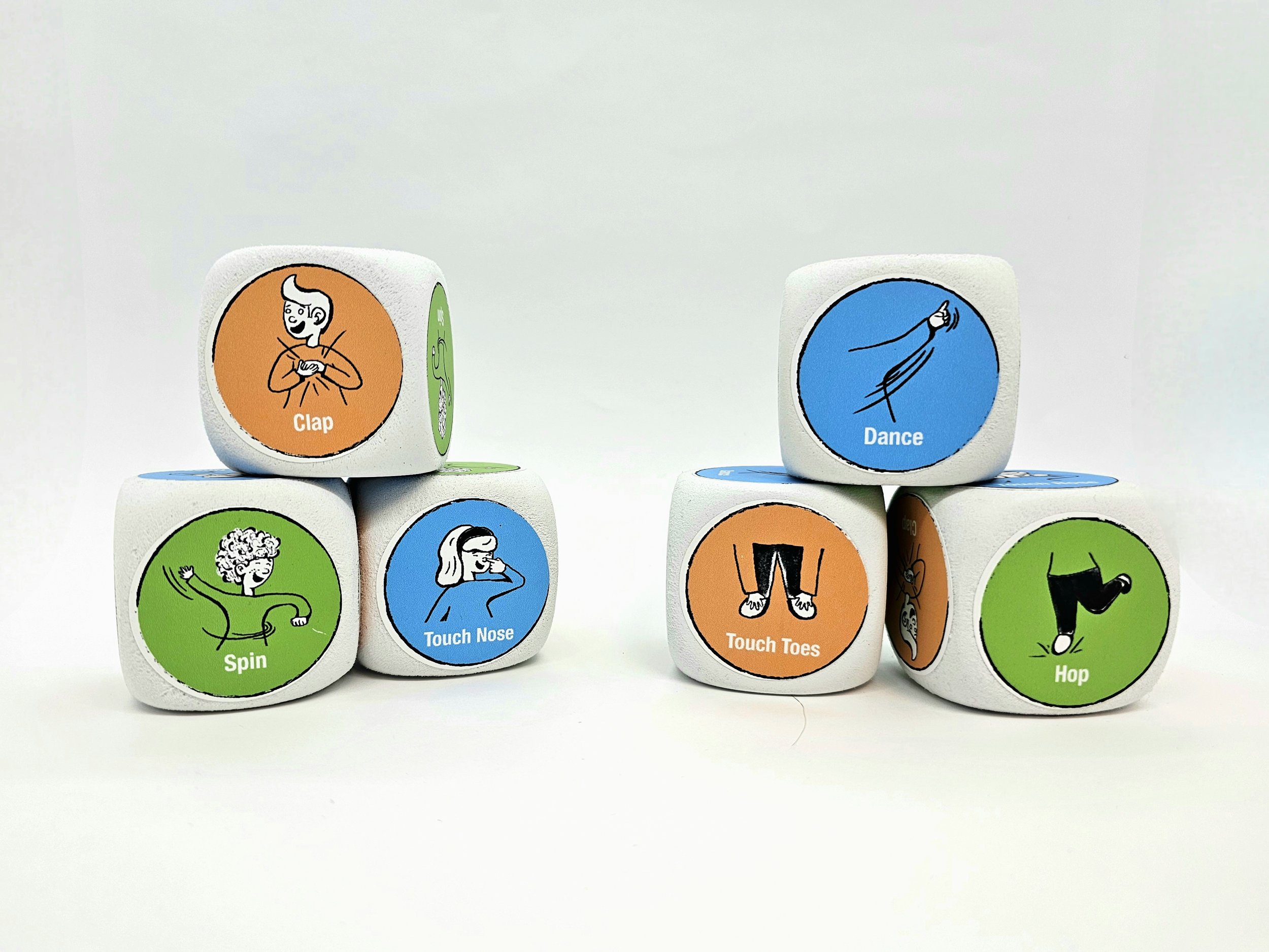
Learning Different Activity Dice
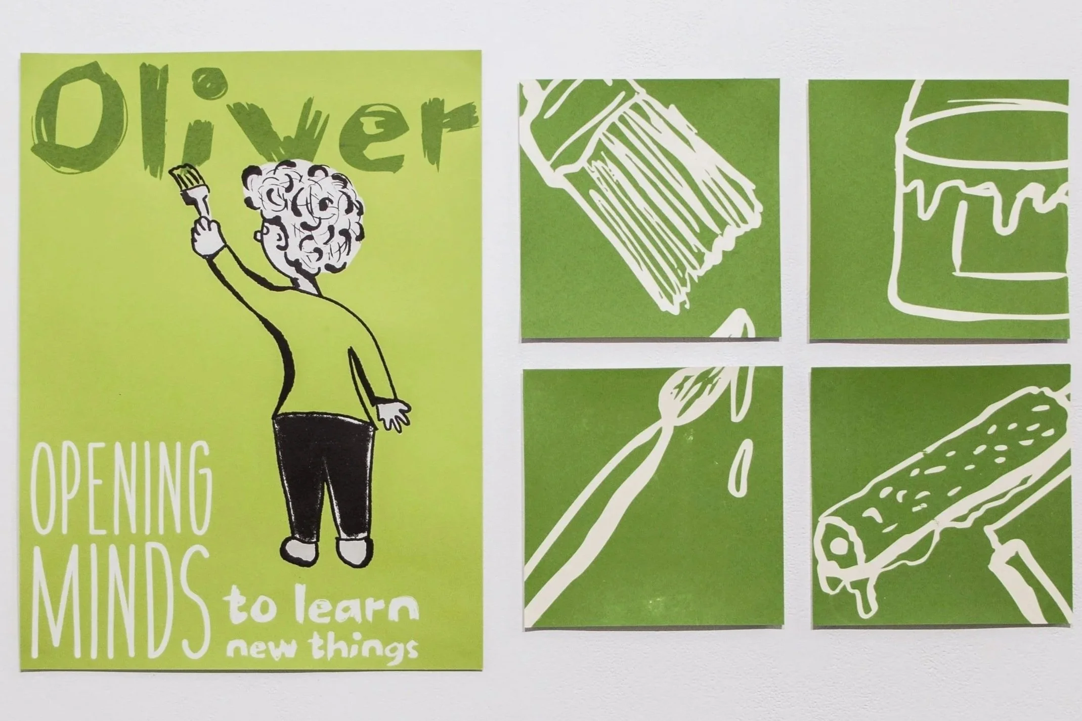
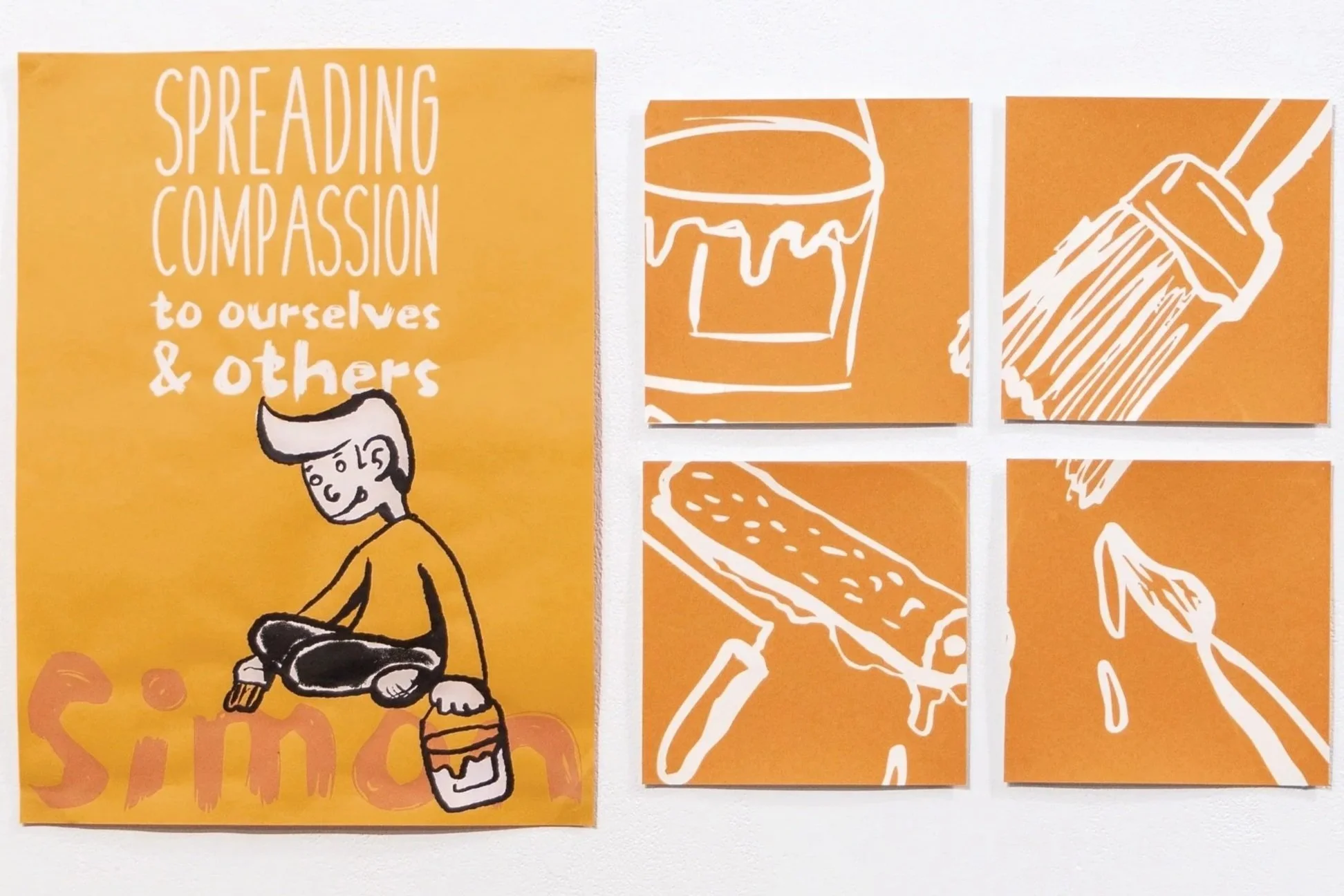

Screen printed Character Posters & Screen Printed Grid Posters
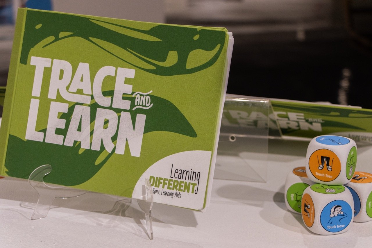
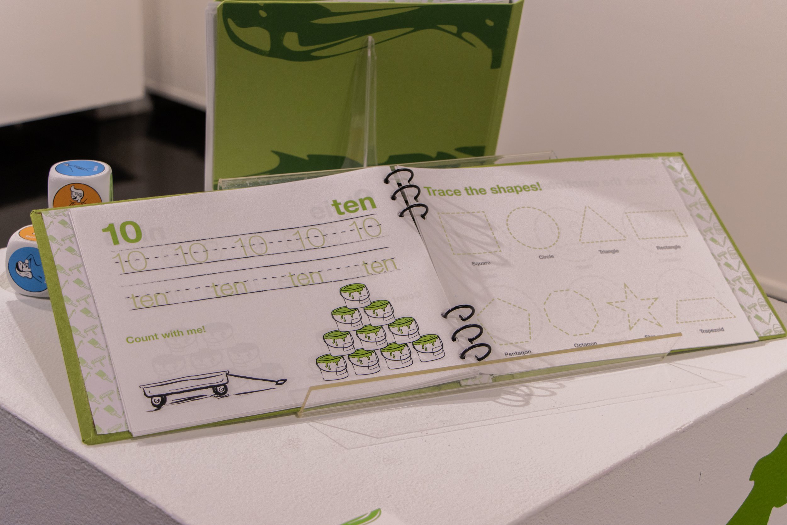

Trace & Learn Activity Binder and Sheets (“Trace the Letter,” “Trace and Count,” & “Trace and Draw”)
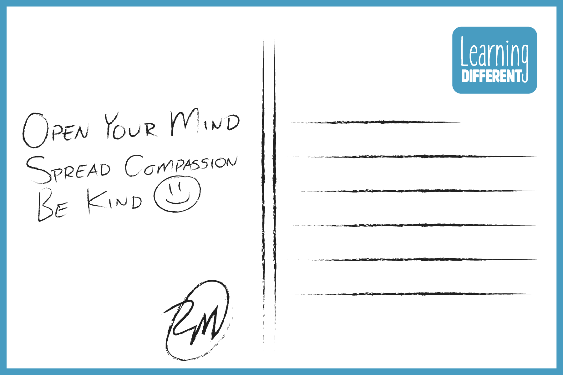
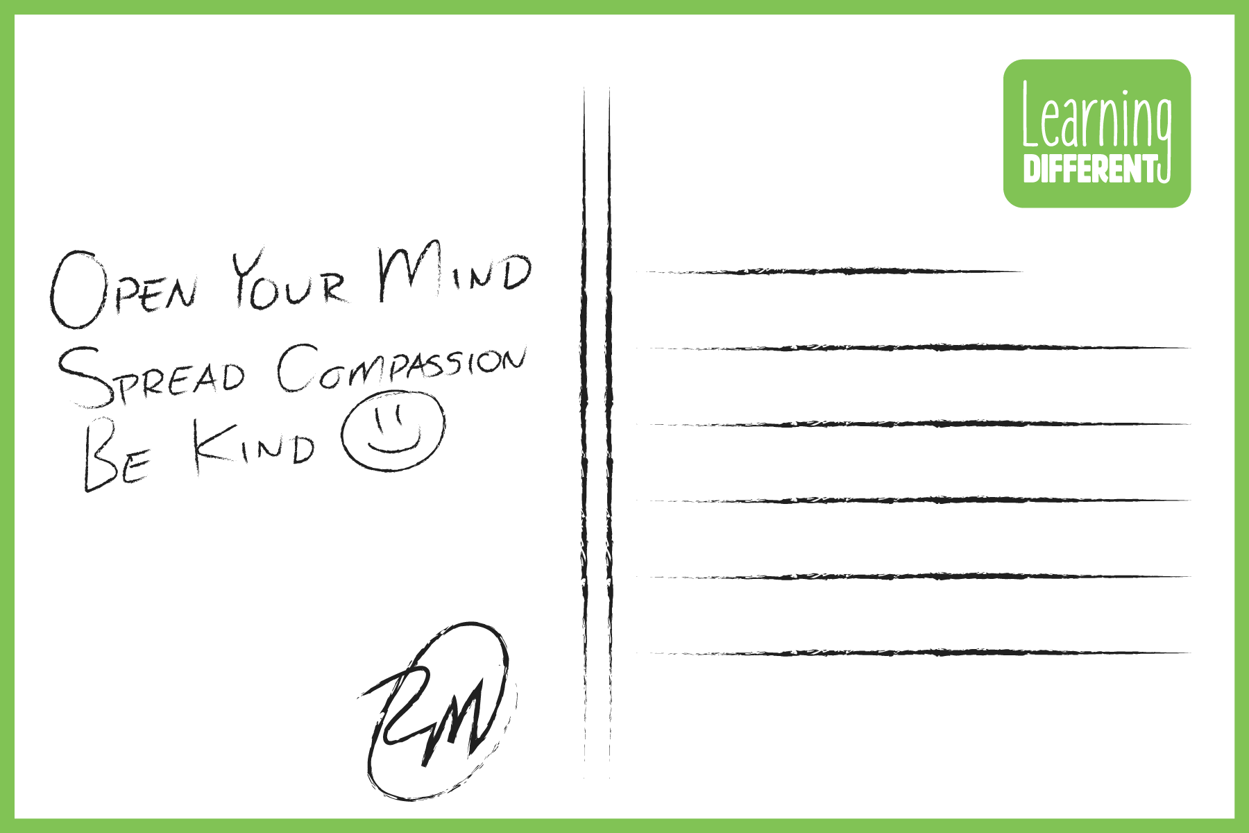
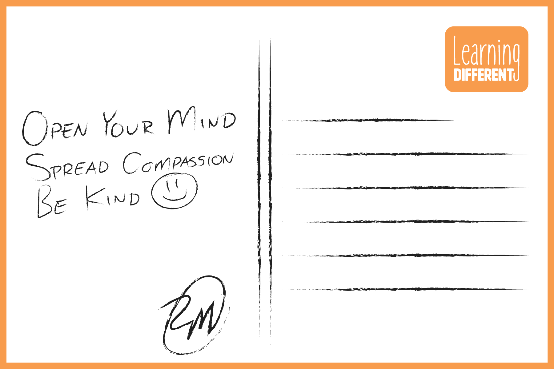
Learning Different Postcards
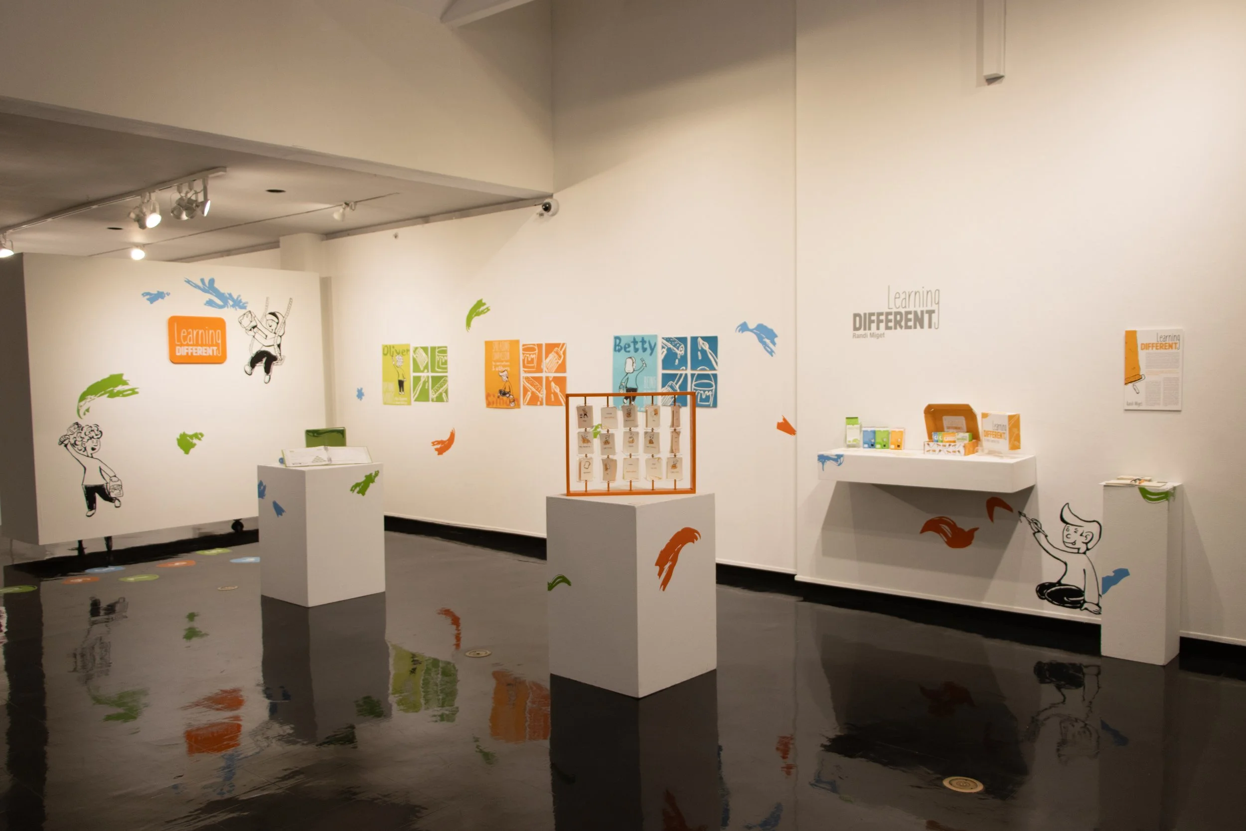
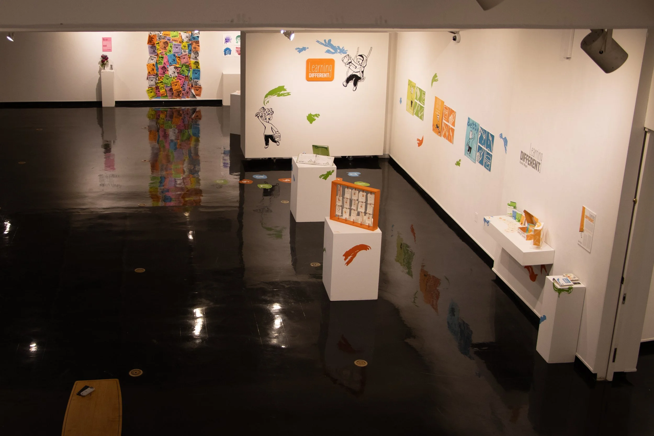
Gallery Space in Clara M. Eagle Gallery at Murray State University, 2025